It᾿s Cloudy? is a weather visualization I made to experiment with the idea of ‘truthiness’ in data. If you put something in a graph, it looks sciencey, even truthy. People tend to believe graphs: computers don᾿t lie!
This is a frequently-exploited aspect of human nature, if you want to convince people something᾿s true, make a chart. But what about the converse? If you take real data and display it in a non-sciencey way, does it still seem true?
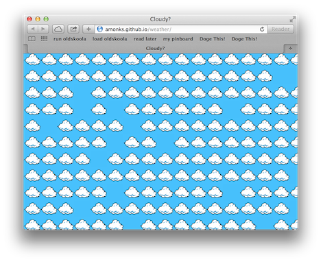
It᾿s Cloudy? seeks to explore that question. It᾿s a visualization of the real-time cloud cover data at the user᾿s location, but presented through a casual 8-bit gaming aesthetic.
The cloudiness of a user᾿s current location determines the cloudiness of the webpage. On a cloudless day, the page will be solid blue. In 50% cloud cover, half of the squares will be filled with clouds.