Seeing Traffic
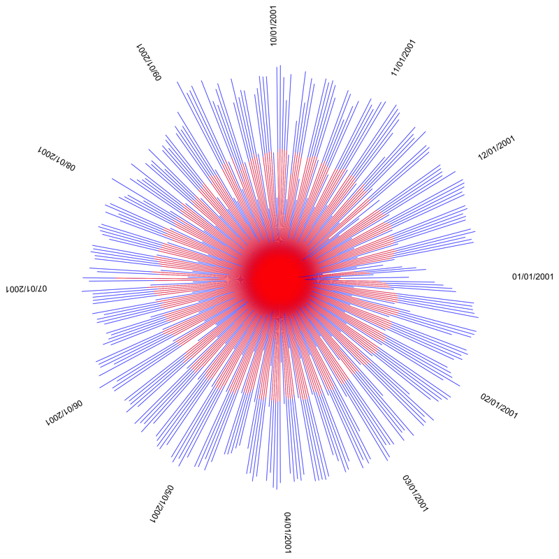
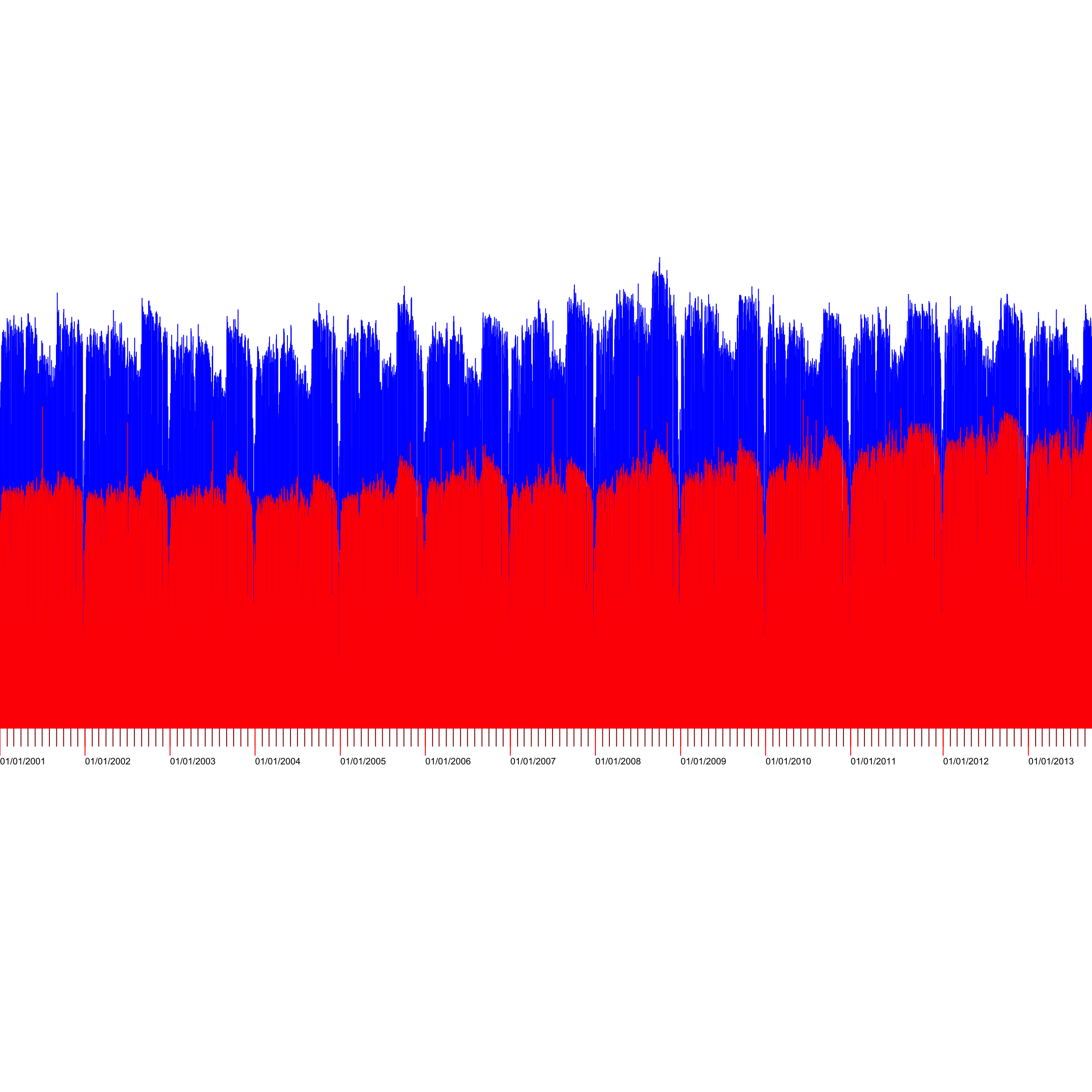
I made these CTA Data Visualizations in 2014 from data put out by the city of Chicago. They graph the CTA᾿s ridership over time.
Conclusions:
- The circle is way less readable than the timeline of all the data
- The trains have been getting more popular lately
- People take the train a lot on the forth of July, unless it᾿s raining.